“The Hague and the Atlantic Wall: War in the City of Peace” was a museum exhibition which ran from April to October in 2015 at Museon in the city of The Hague, in The Netherlands.
The Atlantic Wall was a set of the defensive lines and placements that were built by the German forces during WWII along the coast of the Atlantic Ocean and North Sea, from Norway to the French/Spanish border. The wall consisted of a 5,000 km long chain of bunkers, anti-tank walls, cliffs and other barriers and was aimed at preventing an Allied attack on the Reich’s Western frontiers.
This exhibition focused specifically on the Atlantic Wall in The Hague and the impact of its construction on the city and its inhabitants. Visitors were tracked as they interacted with the exhibition and once they had completed their visit they could visit a checkout point and print themselves a personalized visit souvenir postcard.
It is important to note that the card gave access to visit information held by the museum without the need to leave any personal data such as name or email address. Visit logs were anonymous and linked only to the unique passcode on the postcard.
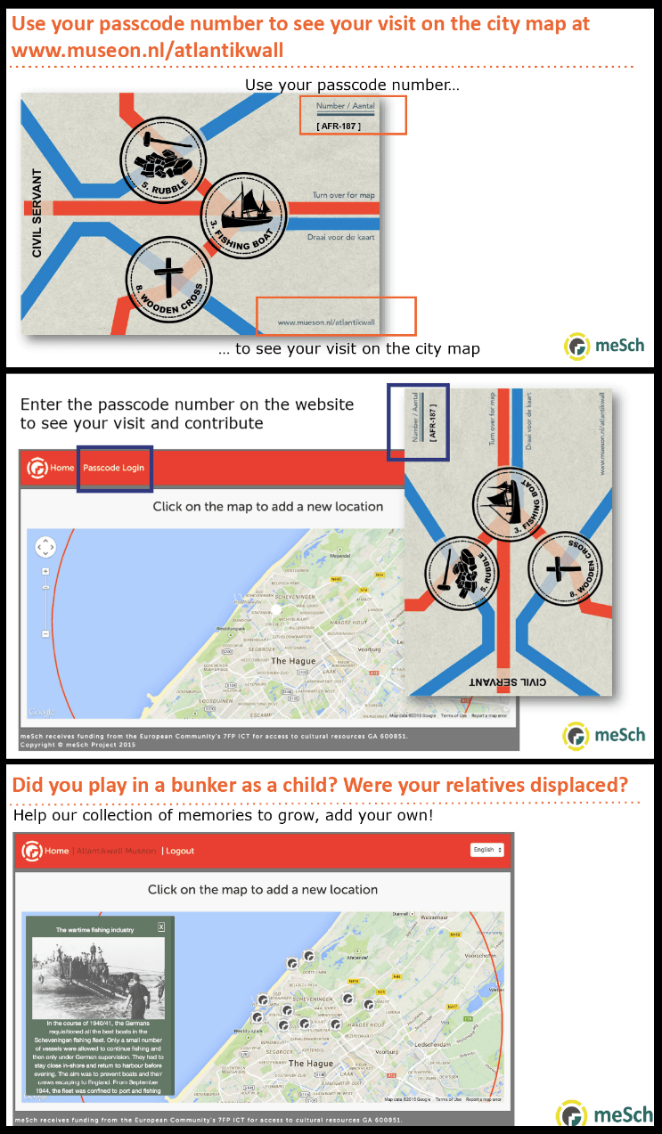
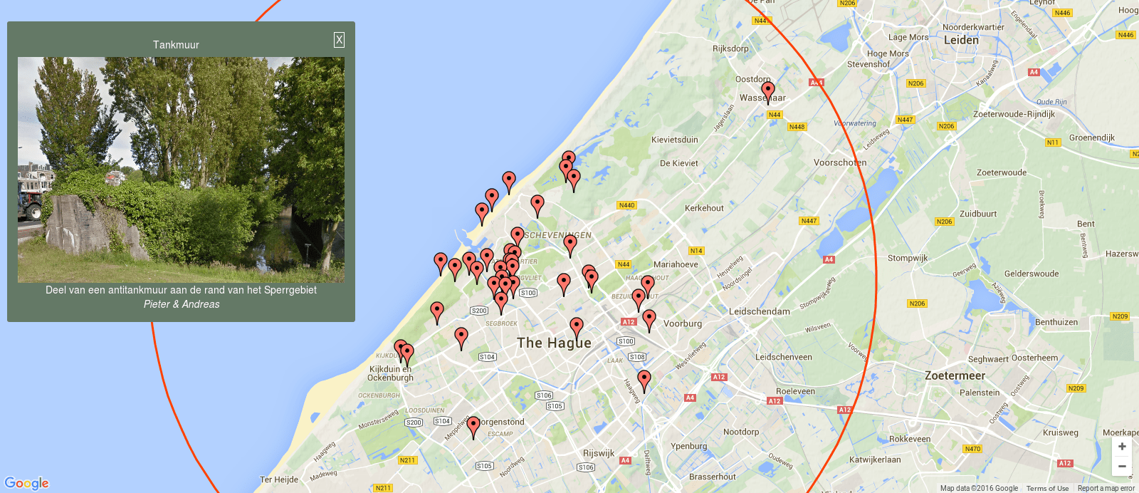
Visitors could use this souvenir to access additional online content after their visit. This website was based on The Hague city map annotated with curated content from the exhibition and enriched by visitors’ contribution. The aim of the curators in requesting this site was to encourage visitors to share their own personal stories in relation to the Atlantic Wall. These stories were publicly accessible via the online platform. In addition a version of the map was displayed in the exhibition on a large touchscreen next to the checkout point to allow visitors to read other people’s stories on site.
Entering their personal code enabled the visitor to add content. At a glance the online visitor could see which content corresponds to the curated Atlantic Wall exhibition (marked with ) and which content was contributed by the visitors (marked with
). Changes in colour showed content that has been viewed in the exhibition or that has been contributed by the visitor themselves to the website.
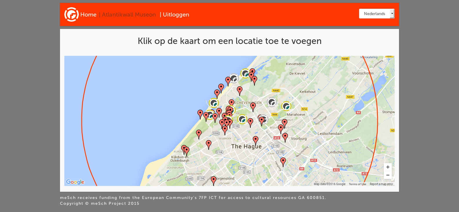
Logged in version of site. From here the user could see the points they had visited (multicolored meSch logo), the points they missed (grayscale meSch logo) and other users stories (red marker).
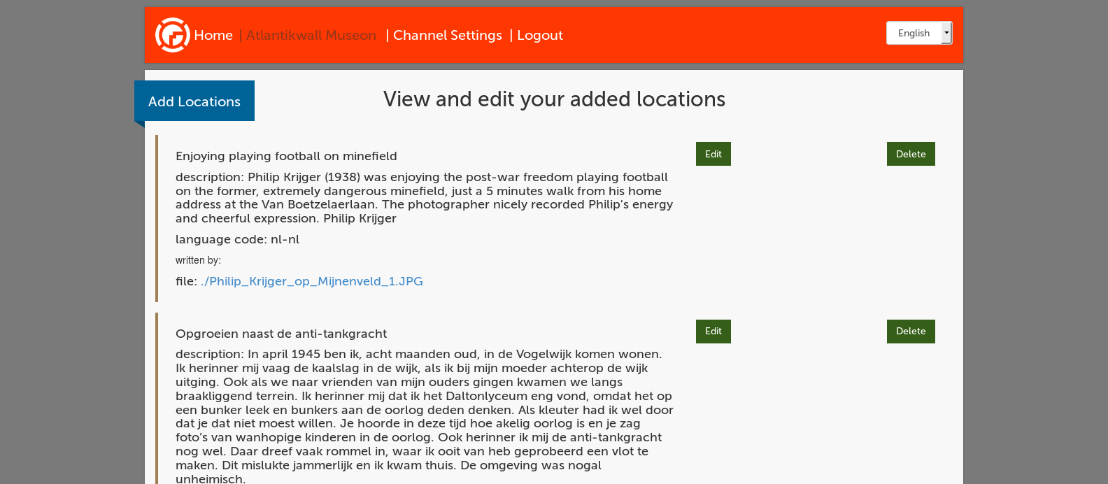
The post-visit interface was provided in both Dutch and English. A drop down box in the top right corner allowed the user to switch from one language to the other. User added points were kept separate by language. Users of the site in Dutch saw only those points added by a user in Dutch, users of the site in English saw only the points added by English users. Use of the platform was significantly higher in the Dutch version.
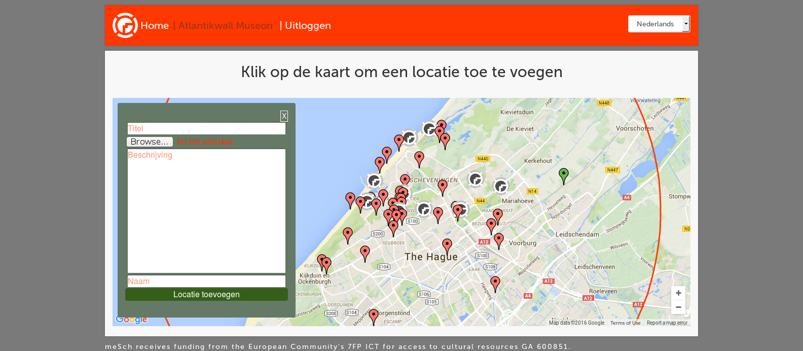
To add their own content the user was asked to” Click on the map to add a new location” (or “Klik op de kaart om een locatie toe te voegen”). This placed a green marker on the map and caused a form to pop up allowing the user to add a title, some text, an image or a video file and their name if they wished.
By showing the visitor the information regarding the cases/points of interest in the exhibition we hoped to remind them of what they had seen and offer the opportunity to look at what has been missed during the visit. By showing them other people’s content we aimed to encourage them to submit content of their own.
Initially the curators wanted to approve all content before allowing it to be placed live however they changed their mind during the development process to allow all content to go live straight away so long as they could have the ability to remove an entry if for any reason it was deemed inappropriate.
Uptake of such post-visit tools are traditionally quite low. To counter this the museum started accepting stories in written format at the checkout point and had a curator add the points of interest later. The on site touchscreen was however observed to be quite popular and when asked a number of visitors expressed pleasure at reading other people’s stories and a willingness to share their own.
The site was built using Python and code is available on bitbucket here.
